
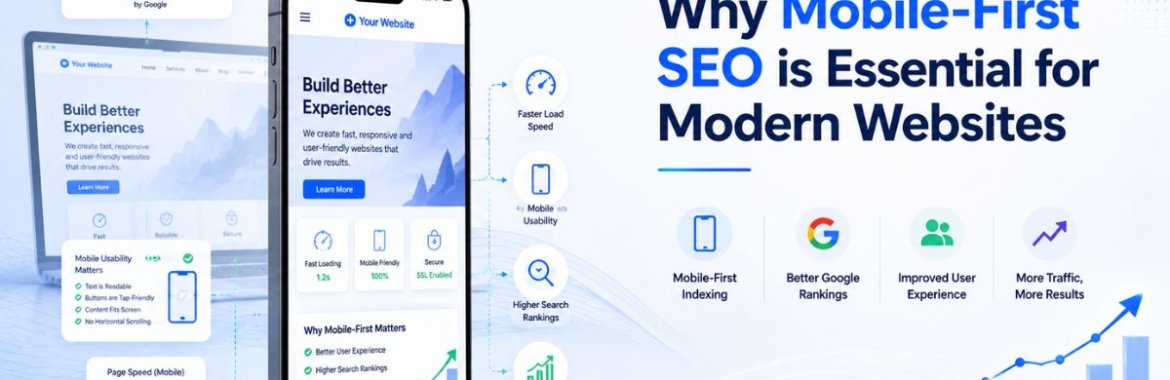
More than three out of every four searches in India now happen on a phone, not a laptop. Google noticed this years ago and switched to mobile-first indexing, which means it crawls and ranks your site based on the mobile version, not the desktop one. Most businesses still design first. If your mobile SEO is an afterthought bolted onto a desktop site, you’re being judged on the weaker version of your own website. That single shift in how Google evaluates sites has quietly reshaped what counts as good practice, and a lot of businesses haven’t caught up. Local agencies offering digital marketing in the Chennai area are constantly asked this question by clients who can’t figure out why their rankings dropped after a redesign that looked fine on a desktop monitor but was never tested on an actual phone.
What Mobile-First Indexing Actually Changed
Before this shift, Google primarily looked at the desktop version of a page to decide how it should rank, even though most visitors were already arriving on phones. That mismatch caused real problems. A site could have a beautifully built desktop experience and a cramped, slow, barely usable mobile version, and Google would still rank it based on the desktop side. Mobile-first indexing flipped that. Now the mobile version is the primary one Google evaluates, so any content, links, or structured data missing from the mobile page essentially doesn’t exist for ranking purposes, even if it’s sitting right there on desktop.
This matters more than most site owners realize until traffic drops. A business that quietly stripped down navigation menus or hid product descriptions behind “read more” toggles on mobile, purely to save screen space, may have unintentionally told Google those elements don’t matter.
The Building Blocks of Mobile SEO Optimization
Getting mobile SEO optimization right involves more than shrinking a desktop layout to fit a smaller screen. Here’s where the real work actually happens:
- A responsive layout has to adapt the actual content and structure, not just scale things down visually. Google checks whether the same information exists in both versions, and many sites quietly drop sections in the process of “going mobile.”
- Spacing between buttons and links matters more than people expect. Cram them too close together, and you get mis-taps, the kind that send someone to the wrong page and straight back out again, which shows up as a bounce rate.
- Font sizes that stay readable without forcing anyone to pinch and zoom. If a visitor has to zoom in to read body text, that’s a signal something’s wrong with the layout, not just an inconvenience.
- Pop-ups and interstitials that block content on mobile screens are penalized directly by Google since they’re disproportionately disruptive on small screens compared to desktop.
- Structured data, meta tags, and alt text need to be present on the mobile version specifically, not just the desktop template, or they won’t be counted at all.
A site that treats these as a checklist tends to perform noticeably better than one that simply assumes “it looks fine on my phone” is good enough testing.
Mobile User Experience and Why It Drives Rankings
Google has gotten increasingly good at measuring how people actually behave on a page, and how someone experiences a site on their phone sits right at the center of that measurement. If visitors land on a mobile page and immediately bounce back to search results, that pattern tells Google something is off, regardless of how well the page is technically optimized on paper.
A few specific behaviors shape how someone actually experiences a page on a phone, and they tie directly into rankings:
- How quickly the page becomes interactive, not just visible, since a page that looks loaded but doesn’t respond to taps frustrates users almost as much as a blank screen.
- Whether forms are actually usable on a small keyboard. A checkout form with tiny input fields and no autofill support loses customers before they finish typing their address.
- How easily someone can navigate back to a previous section without losing their place, particularly on long product or service pages.
- Whether the layout shifts unexpectedly while loading, which is one of the more common reasons, or mobile visitors accidentally tap the wrong thing and leave, annoyed.
Sites that treat mobile user experience as equally important to desktop, rather than as a smaller, secondary version of it, tend to hold visitors longer and convert more of them.
Speed Is Where Mobile SEO Often Falls Apart
Desktop connections are forgiving. Mobile networks are not. A page that loads acceptably on office Wi-Fi can crawl on a 4G connection in a moving vehicle, and Google’s Core Web Vitals measure exactly that kind of real-world performance. Largest Contentful Paint, Cumulative Layout Shift, and Interaction to Next Paint are all measured under mobile conditions, which means a site optimized only with desktop testing tools misses the metrics that actually matter for ranking.
Compressing images, deferring non-critical scripts, and trimming unnecessary third-party widgets usually deliver the biggest speed gains with the least development effort. None of this is exotic technical work; it’s mostly a matter of someone actually prioritizing it instead of treating mobile speed as a problem for later.
Common Mistakes That Quietly Hurt Mobile Rankings
A handful of mistakes show up repeatedly in mobile SEO audits across businesses that haven’t revisited their setup in a while:
- Hiding entire sections of content on mobile to “simplify” the page, without realizing that content disappears from Google’s evaluation, too.
- Running separate mobile and desktop URLs, using an old-style “m-dot” subdomain setup without proper canonical tags, leaves crawlers confused about which version actually counts.
- Newsletter pop-ups that cover the entire screen the moment someone arrives. It annoys visitors and triggers a ranking penalty in one fell swoop.
- Testing only in a browser’s mobile simulator instead of an actual physical device, since simulators don’t always reflect real tap behavior or rendering quirks.
Why This Matters Even More for Local Search
Anyone searching for a nearby restaurant, clinic, or repair shop is almost always doing it from a phone, often while walking or in a cab, with location services switched on. That makes mobile performance inseparable from local visibility. A business whose mobile pages load slowly or render awkwardly loses exactly the customers who are closest to converting, since “near me” searches carry strong purchase intent and very little patience for a page that takes eight seconds to load.
This is part of why mobile readiness shows up so often in conversations about local SEO rather than being treated as a separate technical project. A restaurant with a fast, clean mobile menu page outranks a competitor with better food but a clunky site, simply because Google and the customer both notice the difference within the first few seconds of the visit.
How to Check Where Your Site Actually Stands
Google’s Mobile-Friendly Test and the mobile section of PageSpeed Insights are the fastest starting points, since both flag obvious technical issues within seconds. Search Console’s Core Web Vitals report goes further, showing field data collected from actual visitors rather than a single simulated test. Beyond the automated tools, there’s no substitute for someone manually browsing the site on a real phone, on a real mobile connection, trying to complete the same tasks a customer would: finding a product, filling out a contact form, and reading a blog post all the way through without the layout breaking.
Bringing It Together
Mobile-first indexing isn’t a future consideration businesses can plan for eventually. It’s already how Google evaluates every site today, regardless of whether a business has addressed it. A site with strong mobile SEO, fast load times, and a genuinely usable mobile user experience holds a real advantage over competitors that still design for desktop first and hope mobile works out fine by default. If your last redesign focused entirely on how the site looks on a large monitor, it’s worth getting an honest mobile audit before assuming everything is fine. Businesses working with an established SEO company in Chennai often find that fixing mobile fundamentals delivers faster ranking improvements than almost any other single change, simply because so many competitors still haven’t got the basics right.