
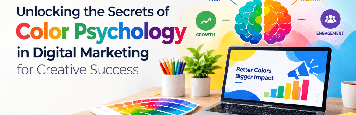
A visitor forms an opinion about a website within 90 seconds, and most of that judgment comes from color before a single word gets read. A misplaced button color or a palette that feels cold has cost brands more conversions than weak copy ever will. At Infinix, a Digital Marketing agency in Chennai, color decisions get built on consumer behavior data, not personal taste. What follows covers the psychology behind color perception, how Indian cultural context changes that psychology, where color affects conversion on a live website, and how to test color choices instead of guessing at them.
The Science Behind Color Perception and Consumer Behavior
The eye processes color faster than it processes text or shape. That single fact explains why a viewer registers the emotional tone of a page before reading the headline. Red pushes urgency, which is why flash sale banners lean on it so hard. Blue reads as reliable and calm, and that’s exactly why banks and healthcare platforms use it more than entertainment brands do. Green ties to growth. Orange sits in an odd middle spot: loud enough to grab attention, warm enough to avoid the aggression that pure red carries.
Context bends all of this. A red error message reads as a warning. A red “Buy Now” button reads as urgency. Nothing about the color changed. The surrounding design did.
Emotional Response Precedes Rational Thought
Marketers like to assume customers weigh a product logically before buying it. They don’t, not first. The emotional read happens before the rational one, and color triggers that emotional read faster than almost anything else on a page.
Why Color Choices Directly Impact Brand Recall and Trust
Color-driven brand recognition runs as high as 80 percent in widely cited branding studies. Coca-Cola red, Facebook blue, Cadbury purple: none of that happened by accident. Each brand locked one dominant color into every touchpoint until the color became shorthand for the brand itself. Consistency did more work here than the actual hue chosen. A brand that shifts its primary color across the website, social pages, and packaging makes the customer relearn recognition cues every time, and that weakens recall instead of building it.
Trust follows a rougher pattern than most marketers expect. Muted, low-saturation palettes read as premium. Bright, clashing color combinations often signal cheap, even when the product behind them is solid. A visitor decides whether to trust a site long before reading a single testimonial, and the palette is doing that convincingly.
Color Psychology Across Cultures: A Critical Consideration for Indian Brands
Most color psychology frameworks in circulation were built on Western research, and using them untouched in Indian markets is a mistake. White reads as purity in Western branding. In several Indian traditions, it carries mourning associations instead. Red carries urgency in Western retail psychology, but across much of India it signals prosperity, marriage, and auspicious beginnings. Yellow ties to festivity and knowledge in Indian symbolism, a very different weight from its Western association with caution.
Regional variation inside India adds another layer that pan-India campaigns often get wrong. A palette built for a metro-focused fintech audience can fall flat with a Tier 2 audience where traditional color symbolism still carries real purchase influence. One national palette rarely fits every region equally well.
Applying Color Strategy to Website Design and Conversion Rate Optimization
Color affects every stage of a digital funnel, not just the landing page. The homepage sets emotional tone. The product page needs enough contrast to make pricing scannable at a glance. The checkout page needs color cues that lower anxiety, because cart abandonment spikes the moment a page suddenly looks unfamiliar.
CTA buttons deserve their own attention here. Contrast against the background matters more than which color gets picked. A button that fails to stand out gets ignored, no matter how good the copy sitting next to it reads. Heat-mapping work from Infinix client accounts has shown CTA visibility changes shifting conversion rates by several points, with the copy left untouched.
Mobile changes the math too. A palette that looks balanced on a desktop monitor can wash out or oversaturate on a phone screen in direct sunlight, and that’s where most traffic now lands.
Common Color Mistakes Brands Make in Digital Campaigns
- Picking colors because the founder likes them, not because the audience responds to them. This pattern loses to audience-tested alternatives almost every time it gets measured.
- Cramming a page with more than three primary colors. The eye has nowhere to land.
- Skipping accessibility contrast checks. Beyond the compliance risk, it quietly locks out visually impaired visitors.
- Ignoring festival calendars. A Diwali campaign that skips traditional color cues hands the moment to a competitor who didn’t.
- Copying a competitor’s palette wholesale. What signals trust for one brand’s positioning can undercut a different one entirely.
- Treating one national palette as good enough everywhere. Tier 2 and Tier 3 audiences often respond to color cues a metro campaign never accounts for.
Testing and Data: How to Validate Color Decisions
Guesswork has no place in color strategy once real traffic is involved.
A/B testing CTA colors on live traffic isolates exactly how much color, on its own, moves click-through rate. Heat mapping shows where attention actually lands, which is often not where the design brief assumed it would. Session recordings catch hesitation points that no static mockup review would ever surface. Contrast ratio audits catch readability failures before they cost a conversion. And running the same palette across desktop, mobile, and tablet checks whether the color story survives outside a controlled design environment.
Brands that run these checks build a color playbook shaped by their own audience, not borrowed from whatever design trend is popular that quarter.
Building Color Strategy Into a Long-Term Digital Presence
Color can’t sit as a one-time decision made during the initial website build. Search engines reward pages that hold attention, and visual design shapes bounce rate and time on page directly, two signals that carry real weight in rankings. A brand chasing organic visibility needs its visual identity and its technical SEO pulling in the same direction. As a full-service Digital Marketing company in Chennai, Infinix builds color-informed design alongside structured SEO work, because a well-designed page that never ranks never reaches anyone. Pairing that with an experienced SEO company in Chennai keeps the visual psychology and the search performance moving together instead of pulling budget in opposite directions.