
Most designers are obsessed with aesthetics that win awards but lose customers. They build pixel-perfect interfaces that look stunning in a portfolio but leave the user confused, frustrated, and most importantly, unlikely to buy. If your website is a digital masterpiece but your average conversion rate is hovering near zero, you don’t have a design problem; you have a conversion problem. You aren’t running an art gallery; you’re running a business. As a forward-thinking Web Development Company in Chennai, we’ve seen countless brands flush their marketing budgets down the drain because they prioritized “pretty” over “functional.”
If your UX doesn’t actively guide a user toward a checkout button or a lead form, it’s just expensive digital wallpaper. You need to stop designing for “likes” and start designing for intent.
The Myth of the “Beautiful” Bounce
High bounce rates are rarely caused by “ugly” websites. They are caused by friction. Friction is anything that makes a user think twice, hesitate, or work harder than they need to. In the world of website UX optimization, the goal isn’t to dazzle the user; it’s to disappear. When you remove that friction, you’ll see your average conversion rate start to climb because users are actually finishing what they started.
When a visitor lands on your page, they have a limited “cognitive load.” If they have to hunt for a menu, decode a cryptic headline, or wait six seconds for a 4K hero image to load, they are gone. You’ve lost them to a competitor who understands that speed and clarity are the ultimate design principles.
1. The Rule of Visual Hierarchy: Control the Eye
You cannot treat every element on your page with equal importance. If everything is loud, nothing is heard. Successful conversion-rate optimization (CRO) starts with controlling exactly where the user looks first, second, and third.
- The F-Pattern vs. The Z-Pattern: Users don’t read; they scan. For text-heavy pages, design for the F-pattern. For landing pages with a single goal, use the Z-pattern to lead the eye from the logo to the “Contact Us” button.
- Contrast as a Tool, Not an Accent: Your Call-to-Action (CTA) shouldn’t blend in with your brand palette. It should scream. If your site is blue and white, your button should be orange or lime green. You want a “clash” that signals a decision point.
2. Hick’s Law: Kill the Paradox of Choice
One of the fastest ways to tank your average conversion rate is to give your users too many options. Hick’s Law states that the time it takes to make a decision increases with the number and complexity of choices.
If your navigation menu has 12 items and your homepage has four different CTAs, you are paralyzing your prospects. A high-converting funnel narrows the path.
- One Goal Per Page: If the goal is a sign-up, remove the “Latest News” sidebar.
- Micro-Conversions: Break long forms into multi-step processes. Asking for ten fields at once feels like an interrogation; asking for a name and email first feels like a conversation.
3. The Scarcity and Urgency Loop
UX design for conversions isn’t just about buttons; it’s about psychology. Human beings are hardwired to avoid loss more than they desire gain. If your UX doesn’t communicate why the user needs to act now, they will “think about it” and never come back.
- Real-Time Data: Show stock levels or the number of people viewing an item.
- The Countdown Factor: Use limited-time offers that are visually integrated into the header. But a word of warning: don’t fake it. Users can smell “fake urgency” from a mile away, and once you lose trust, your UX is irrelevant.
UX Design for Conversions: The Technical Debt
You can have the most persuasive copy in the world, but if your technical UX is lagging, your conversion data will stay in the red. UX design for conversions requires a brutal look at the backend performance.
Mobile-First is No Longer a Suggestion
If your mobile experience is just a “shrunken down” version of your desktop site, you are failing. Real UX design for conversions means designing for a thumb, not a mouse. If a user can’t hit your CTA while they’re walking or distracted, you’ve lost that sale.
- The Thumb Zone: Place critical buttons where they can be reached easily with one hand.
- Input Optimization: Use numeric keyboards for phone number fields. Don’t make people switch keyboards manually. It sounds small, but these micro-frustrations compound into high abandonment rates.
Speed is the Ultimate Feature
A one-second delay in page load time can result in a 7% reduction in conversions. This isn’t a “developer” problem; it’s a design problem. Designers often bloat sites with heavy scripts and unoptimized assets. Every element you add to a page must justify its weight in gold. If it doesn’t help the user convert, cut it.
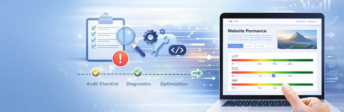
The “Friction Audit”: How to Find the Leaks
Most businesses guess where their UX is failing. Stop guessing. A proper friction audit is the backbone of website UX optimization. It shows you exactly where the money is leaking out of your funnel so you can fix it with data, not opinions.
- Heatmapping: Use tools to see where people are clicking and where they aren’t. Are they clicking on non-linked images? That’s a sign they want more info.
- Session Recordings: Watch five minutes of a real user struggling to find your “Add to Cart” button. It’s the most painful and productive five minutes you’ll ever spend.
- Form Analytics: Where do people drop off? If everyone quits at the “Phone Number” field, remove it. Do you really need it?
The Post-Conversion Experience
UX design for conversions doesn’t end when the “Thank You” page loads. The most successful brands understand that the easiest conversion is the second one. Focusing on the user experience after the click sets a one-time success apart from a website that maintains average conversion rates consistently.
- Confirmation Clarity: Does the user know exactly what happens next?
- Reduced Buyer’s Remorse: Use the post-purchase UX design for conversions to reinforce the value of their decision. Show a testimonial or a “What to expect” video immediately after the transaction.
Stop Playing it Safe
The “standard” way of doing things is usually the average way. And average doesn’t dominate markets. To truly win, your website UX optimization needs to be a reflection of your brand’s unique authority. Don’t just copy a template because it’s easy. Build a path that reflects the specific anxieties and desires of your audience.
If your website feels like a maze, don’t be surprised when people leave. If it feels like a guided tour, don’t be surprised when your revenue scales. Conversion‑rate optimization design is about empathy, understanding the user’s pain, and providing the fastest, most frictionless route to a solution.
Conclusion: Results Don’t Lie
In the end, your analytical dashboard is the only critic that counts. You can spend all day debating fonts and colors, but the data is what actually shows if your website UX optimization works. If you aren’t testing your changes, you’re just guessing.
A website shouldn’t just sit there; it should be working for you. At infinix360, we build sites designed to turn traffic into sales. As the best Digital marketing agency in Chennai, we don’t get hung up on making things look “nice” if they don’t perform. We’re less interested in winning design awards and more interested in your sales numbers. Let’s stop worrying about the visuals and start focusing on what actually makes you money.
Leave a Reply